Custom chart color pallets in Flexmonster
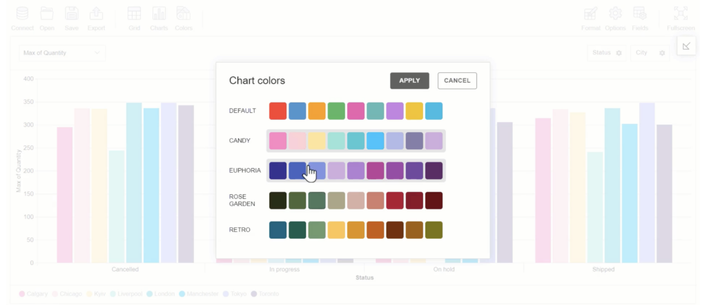
Our tech team is dedicated to providing you with practical tips to make your experience Flexmonster Pivot Table more efficient. If you enjoyed our previous article on creating a custom theme for your report you’re in for a treat. Today, we’ll take customization a step further by demonstrating how to change chart colors directly from the user interface (UI) and apply those changes to all chart types.
Why to have colored charts?
In data visualization, color plays a critical role. It can strengthen brand recognition, highlight essential information, and influence how your data story is perceived. By customizing the colors in your Flexmonster charts, you can create reports that are not only visually appealing but also effective in communicating information.
Whether you want your charts to match your company's branding, draw attention to specific data points, or make your reports accessible to a wider audience, custom colors can be a valuable tool. This article will guide you through creating a user-friendly interface to apply different color palettes to any Flexmonster chart. For a comprehensive guide and detailed explanation, be sure to watch our video tutorial, where our Tech team will walk you through each step.

Behind the Code
The provided in the tutorial code demonstrates the steps involved in creating this functionality. You can explore the code of the demo in our JSFiddle. Here's just a breakdown of the key components:
Toolbar Customization:
The customizeToolbar function modifies the default Flexmonster toolbar by adding a new tab named "Colors" with a new icon. When clicked, this tab will trigger the color selection popup. You can find the tutorial on how to customize the toolbar on our YouTube channel or read more in our documentation.
Predefined Color Palettes:
JavaScript object named colors stores several predefined color palettes. Each palette has a unique name and an array of color codes.
Mapping Member Labels to Colors:
The mapMemberLabelsToColors function creates separate mappings for legend colors (based on columns) and pie chart legend colors (based on rows) to handle different color application scenarios for various chart types.
Customizing Chart Elements:
The customizeFunction is the core function responsible for applying color adjustments to individual chart elements. It receives data about the element and its type.
function changeChartColors() {
  mapMemberLabelsToColors();
  pivot.customizeChartElement(customizeFunction);
  closeChartColorsPopup();
}
Based on the chart type (data.chartType) and the presence of data in columns or rows (data.columns and data.rows), the function applies colors differently:
- For legend: It assigns colors based on the mapped legend colors (
legendColorsorpieLegendColors) for the corresponding member label. - For chart elements: It uses the mapped colors depending on the chart type (column charts, pie charts, line charts, etc.) and the presence of data in columns or rows.
Applying Color to Chart Types:
The applyColorToChartType function handles the logic of applying colors to various charts depending on their types.
Conclusion
Color can be a secret weapon for creating impactful data visualizations. Custom chart color palettes in Flexmonster can allow for extensive customization and personal expression in data visualization. This functionality enhances the visual appeal and clarity of your data visualizations, allowing users to customize their reports to their preferences.
Stay tuned for more tips and tricks from our Tech team!


