Release highlights: improving UX of Flexmonster
With user-centered design in mind, we always strive to deliver top-notch UI updates to you.
But we care not only about making the design of the component visually appealing but also about ensuring that your interaction with Flexmonster is delightful and intuitive in all respects.
That's why, during planning every release we aim to identify usability problems with the UI design by gathering feedback from different sources: our customers, end-users, individual industry specialists, product designers, and other experts. Thanks to them, we defined the following goals to reach within our latest updates:
- Minimize cognitive workload by increasing the visibility of elements.
- Give enough visual cues (e.g., tooltips, new icons) that assist in discovering the essential reporting features.
- Provide with a visual response (e.g., pop-ups) once specific actions are made.
And we're pleased to introduce to you the results of our work! All the notable improvements are meant to increase your focus on what is truly important in your data analysis process.
So, let's dive in!
Bringing more features to the context menu
The most noticeable update is that more features are accessible right from the grid. We've significantly extended the context menu with new items - now more essential reporting features are at your fingertips.
You can right-click to:
- Change the aggregation of the measure:

- Open the conditional or number formatting pop-up windows:

- Open the filter view of a specific hierarchy:
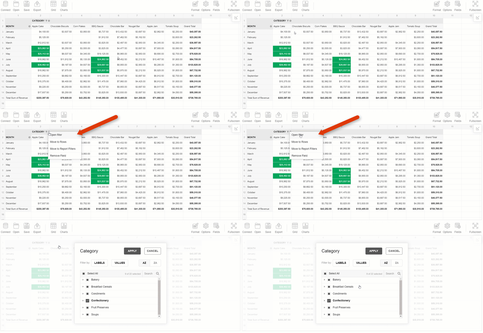
- Filter by a particular member:

- Edit a calculated value:
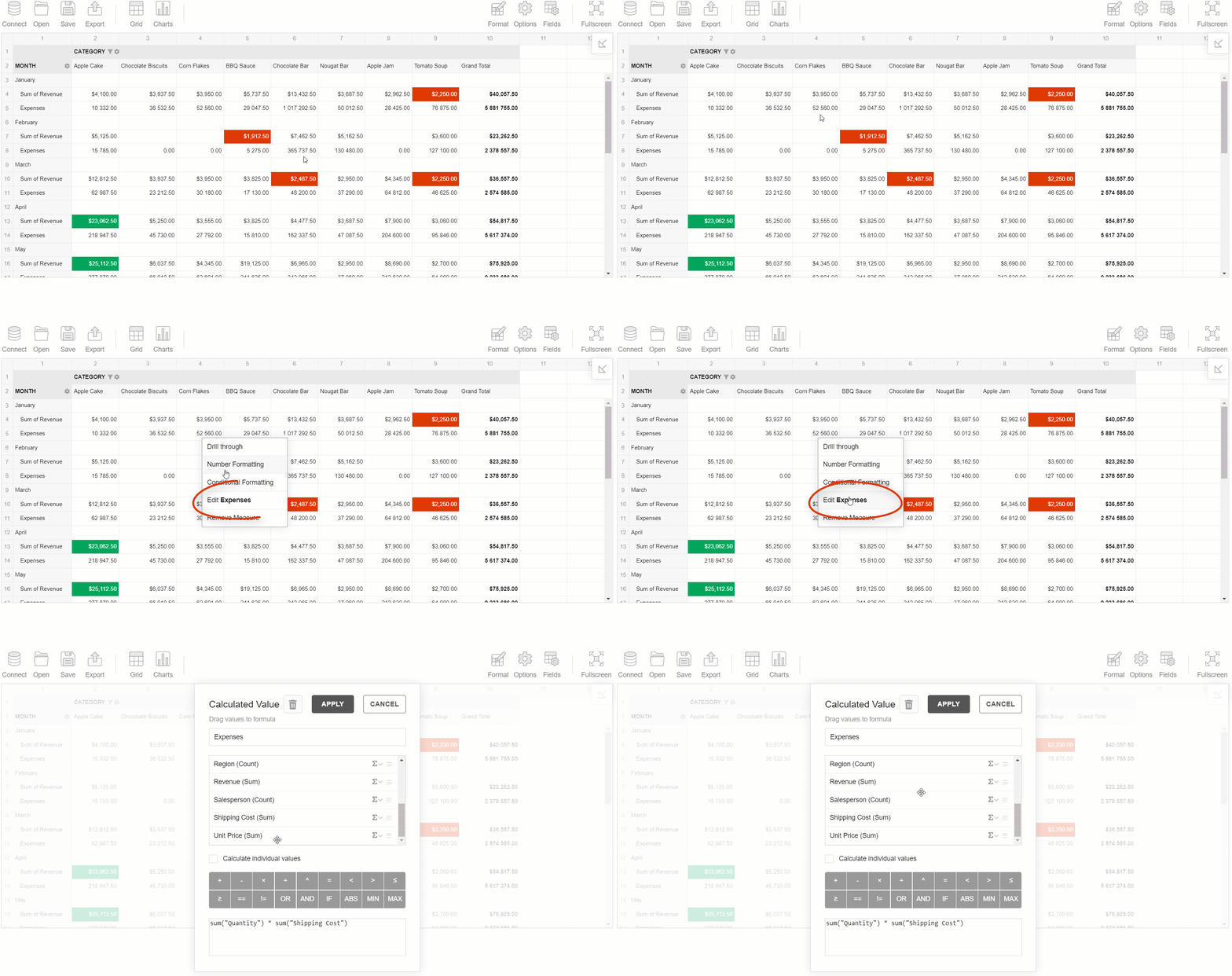
- Move the hierarchy to the rows, columns, or report filters:
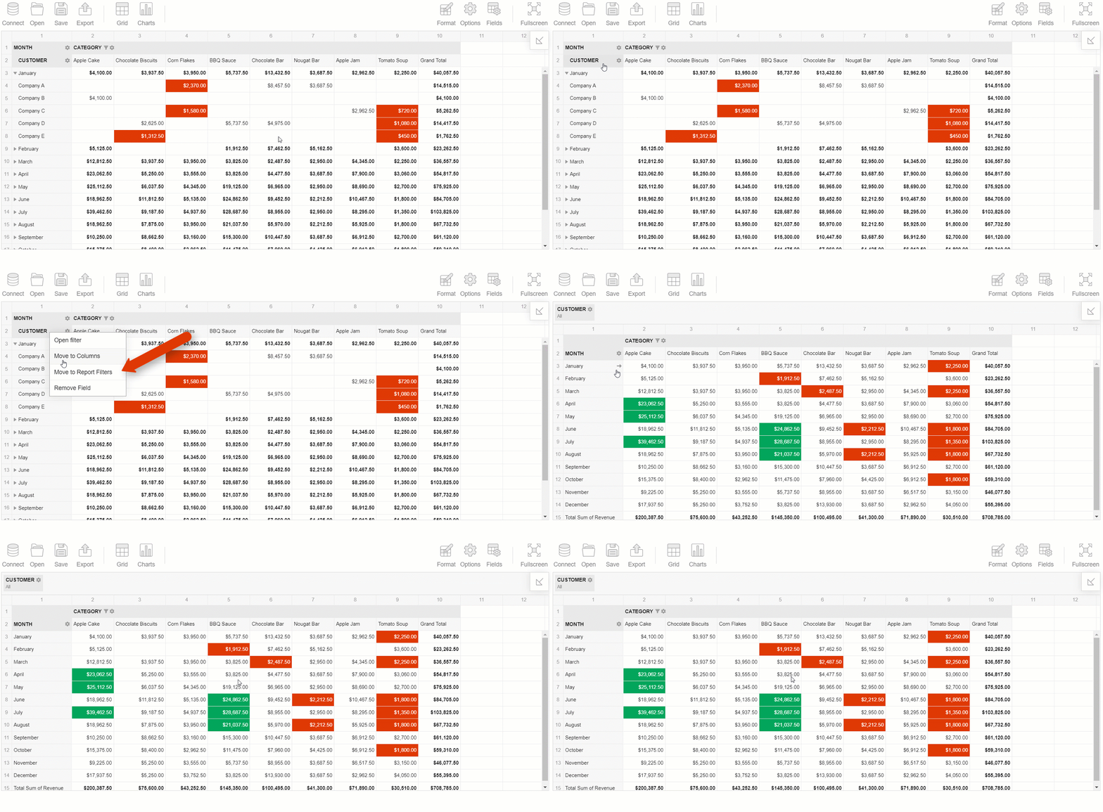
- Remove any measure or hierarchy from the grid:
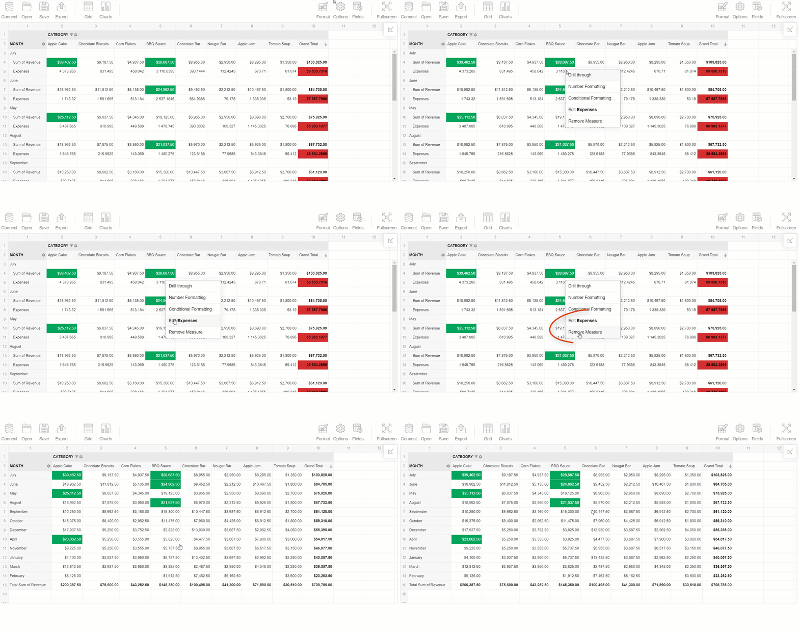
Improving the Field List experience
We haven't overlooked the Field List as well and refreshed it by adding new cool UI elements.
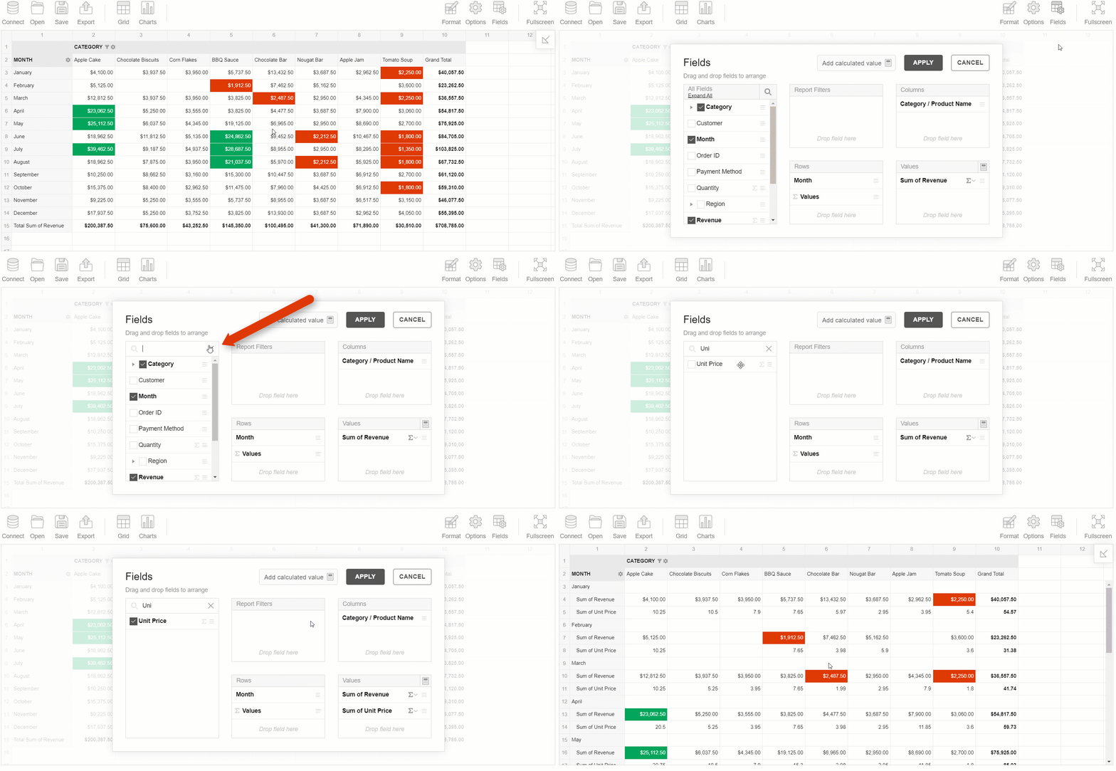
- You can make the search box always shown:
See how smoothly it works:
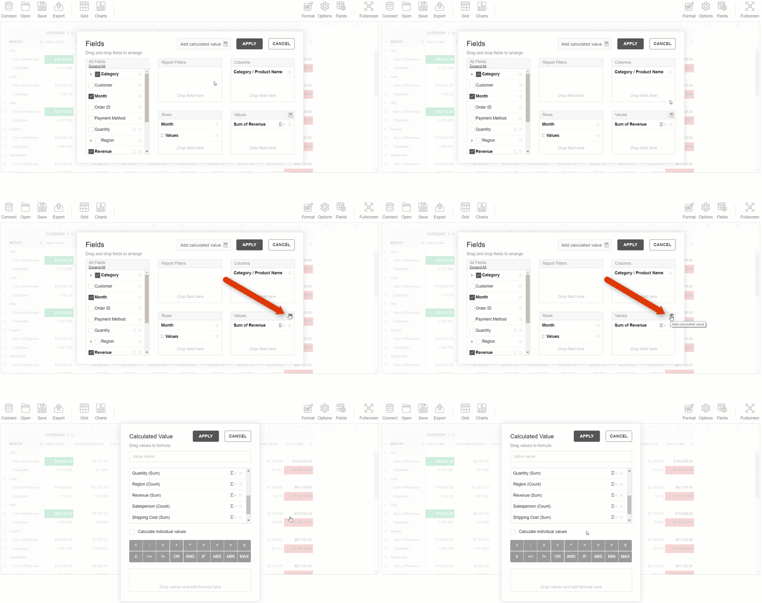
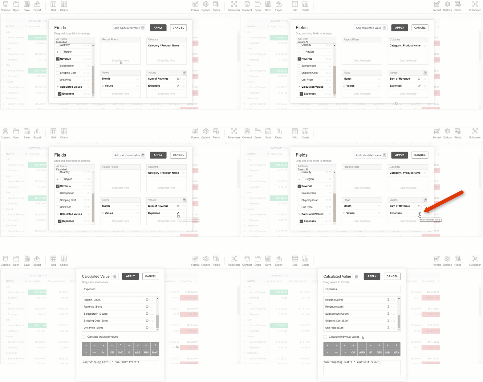
- You can add new calculated values and edit them via the Values box:
There’s more to check
Working with formatting
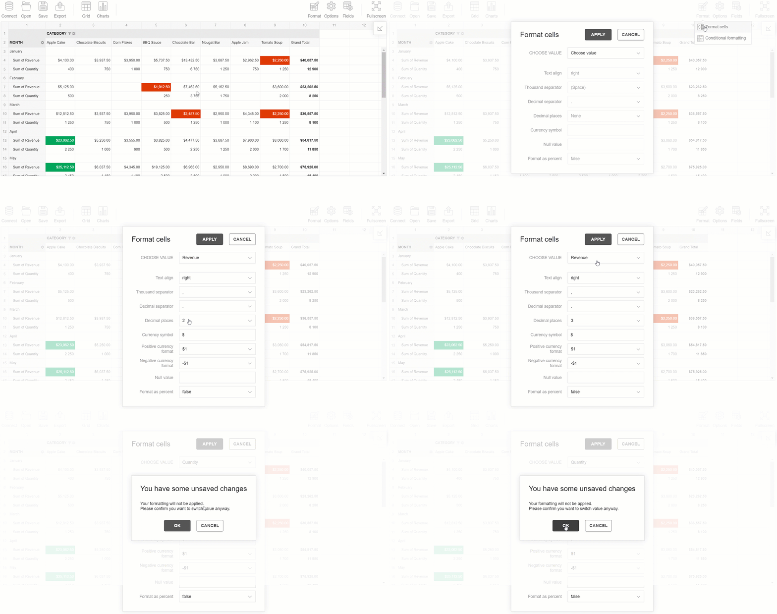
Plus, we secured you from losing the formatting results.
Now if you have an unsaved number formatting configuration, Flexmonster prompts you to confirm your intention to switch to another value:
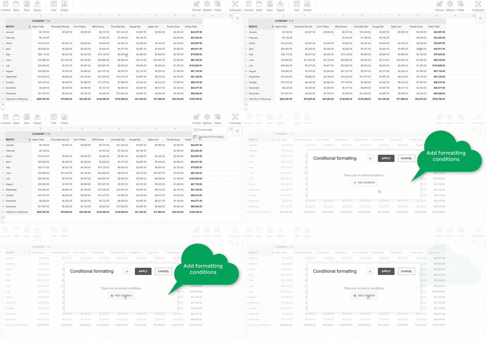
We've also made some conditional formatting refinements. If there is no active formatting condition, you see a notification about it in the formatting box:
Speeding up formulas composing
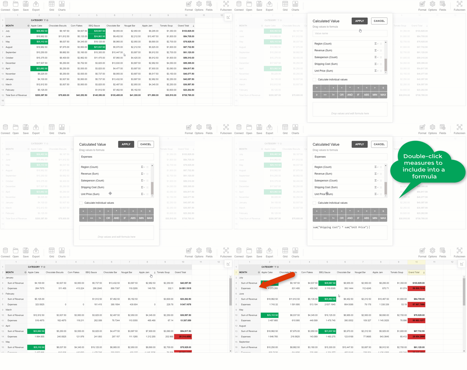
Adding fields to the formula of a calculated value is can be done by double-clicking:
New visual cues
Though we adhere to the principle that the design has to be completely self-explanatory, we couldn’t neglect to make your experience more intuitive by adding extra discoverable tooltips.
Henceforth, more elements are accompanied by tooltips when being hovered over.
Try exploring them all!
A bonus: you can localize tooltips alike any other text in the component.
Closing words
We believe that both design and functionality bring value into your experience, thus, they have to be in harmony.
You can test them all the updates in the latest version of Flexmonster - simply download a 30-day free trial version.
Share your thoughts
Your feedback is what drives our progress. Based on it, we can iteratively enhance our product’s usability.
Please give us your feedback about your reporting experience on Capterra.
We are looking forward to hearing from you.
Your Flexmonster team.


